

Code Name: Digital Magenta
If you’ve visited our neck of the woods recently, you might have noticed things look a little different around here. Actually, scratch that, they look completely different.
Welcome to the new era of Lodestar Digital.
As part of our integration into our new parent company, Lodestar Media, the powerhouse driving British Columbia’s most trusted community media, news, and lifestyle brands, we realized it was time for our digital marketing agency to undergo an evolution of its own. We didn’t just tweak a logo or change a font. We stripped down our old identity, looked at the future of the digital landscape, and rebuilt ourselves from the ground up as a contemporary, design-first, data-driven powerhouse.
Here is an inside look at how we’ve upgraded our brand, why we did it, and what it means for the businesses we guide every day.
Out with the Safe: Moving Past the Old Blueprint
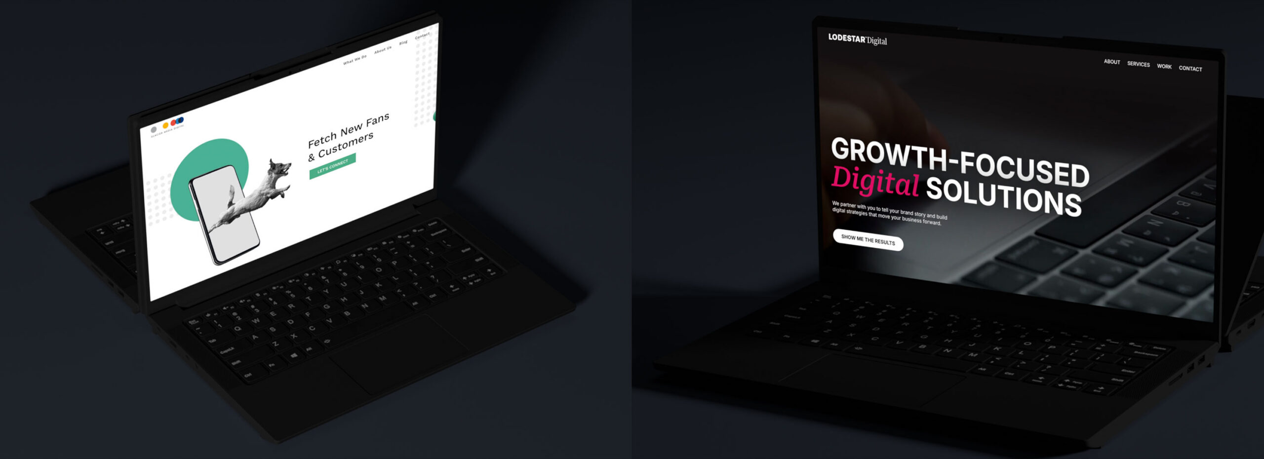
Every great evolution requires acknowledging where you came from. In our previous brand guidelines as Glacier Media Digital (GMD), we leaned into a very traditional, primary-leaning palette: familiar reds, yellows, greens, and blues. While these safe, friendly tones served their purpose and established a sense of reliable accessibility, they were ultimately built for a different era of the web.
But the digital world doesn’t move at a traditional pace.
As we stepped into our role as a full-service, integrated media marketing agency, we realized that “safe” wouldn’t cut it anymore. Our clients don’t come to us to blend in; they come to us to make noise, dominate search rankings, capture attention, and scale aggressively. Our brand needed to mirror that high-performance momentum and forward-thinking leadership.
Out with the Safe: Moving Past the Old Blueprint
Our creative journey began by looking ahead. When crafting our new aesthetic, we drew heavy inspiration from futuristic art and cyberpunk design (even curating an extensive aesthetic mood board to capture the vibe).
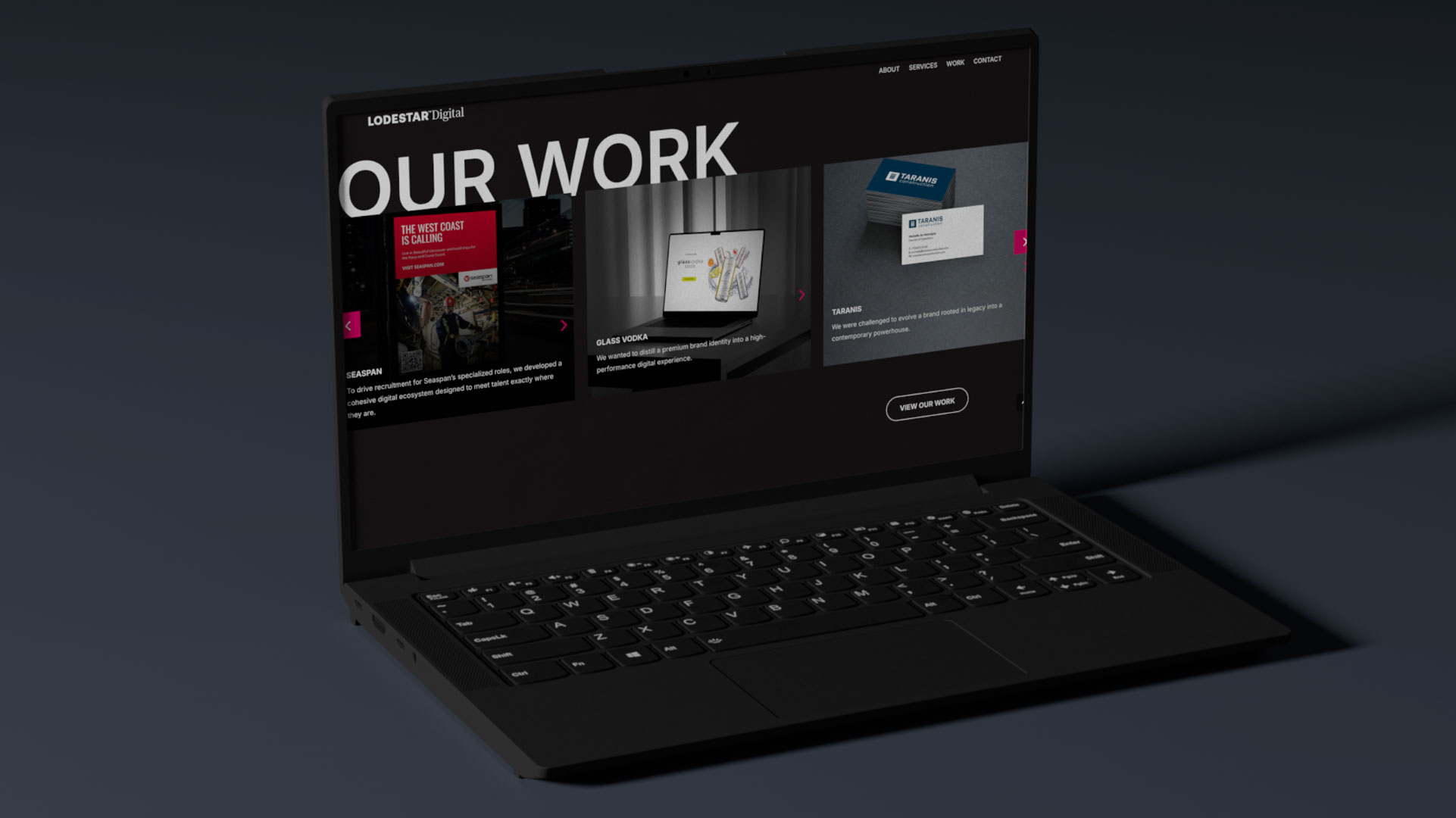
We shifted away from flat corporate graphics toward a deep, high-contrast colour palette, with vibrant/neon accents, creating a bold and modern aesthetic. We envisioned a brand that feels less like a stuffy boardroom and more like a high-tech command center, bringing an aesthetic that bridges the physical community presence of Lodestar Media with the vast, borderless potential of the digital world.
This aesthetic signals exactly who we are today: a merry band of digital mavericks who combine journalistic-level brand trust with cutting-edge marketing technology.
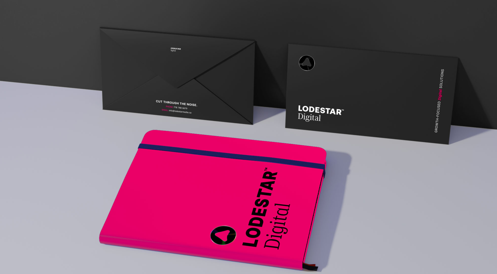
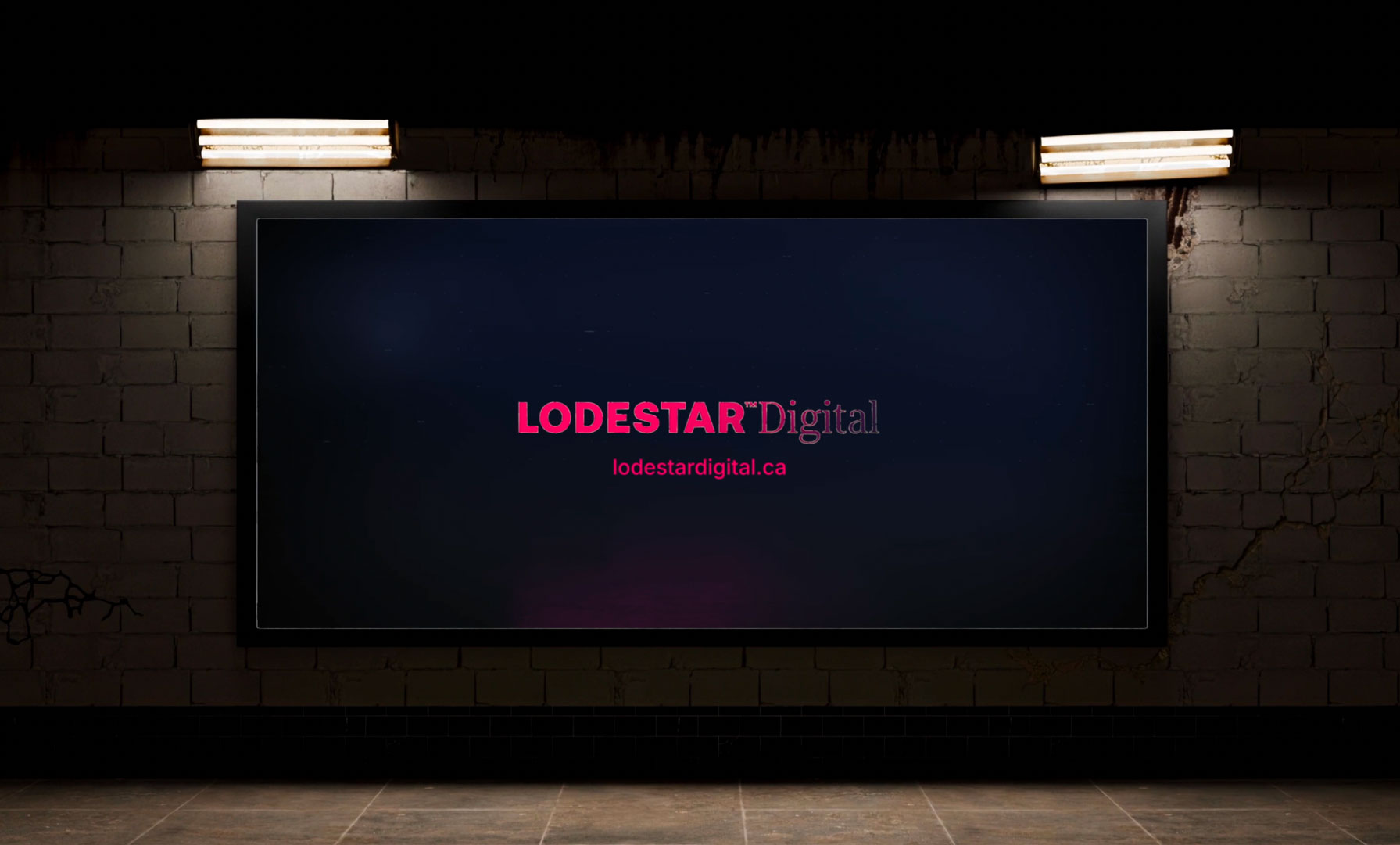
The Pulse of Our New Identity: “Digital Magenta”
The crown jewel of our rebrand is our new signature colour: Digital Magenta. We chose this hue intentionally for its psychological, cultural, and scientific impact.
- Urgency & Excitement: Bordering on red, Digital Magenta triggers a physical response. It increases heart rate and creates an immediate sense of “now.” In digital marketing, capturing immediate attention is everything. This colour represents our commitment to fast connectivity and high-impact results.
- Confidence & Non-Conformity: It is a bold, unapologetic choice. It tells the world that Lodestar Digital isn’t afraid to stand out or disrupt traditional spaces. It has the maturity our enterprise clients expect, mixed with a playful, creative edge that rejects corporate stuffiness.
- The “Disruptor” Aesthetic: In the tech and digital space, high-chroma magenta radiates modernity. Its synthetic vibrance evokes premium “power-pink” luxury and editorial fashion, moving far away from soft pastels and directly into high-speed, high-performance tech energy.
- A Perceptual Bridge: Scientifically, magenta is an “artificial” colour because it doesn’t possess its own single wavelength on the visible spectrum. Our brains literally invent the colour to bridge the gap between red and violet. We love this metaphor: Lodestar Digital is the perceptual bridge for your business, connecting raw data and strategy with creative storytelling to make your brand unforgettable. When placed against deep blues or blacks, it creates a visual effect where the colour appears to vibrate or hover, bringing an organic, living pulse to our digital screens.
What This Means for You
A brand upgrade is only as good as the value it delivers to its partners. Our new look reflects an agency that is faster, sharper, and deeply integrated.
Backed by the incredible reach of Lodestar Media (reaching millions of Canadians every month across BC’s most-loved news, business, and real estate channels), Lodestar Digital is uniquely positioned to take your business further. Whether we are launching hyper-targeted Digital Out-of-Home (DOOH) campaigns, engineering conversion-focused landing pages, optimizing your SEO, or writing blogs that buzz, we are doing it with a design-first mindset and data-proven execution.
We’ve officially upgraded our look to match the calibre of the work we’ve been delivering all along.
Take a look around our newly deployed home at lodestardigital.ca and explore our parent universe at lodestarmedia.ca.
The digital future is bright, vibrant, and glowing in magenta. Are you ready to make some noise with us?